Smart web design for independent businesses.
We craft digital experiences that grow your brand — from stunning websites to SEO strategies and AI-powered applications.
How can we help today?
Everything you need to grow your business online — all under one roof.
Need a new website?
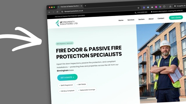
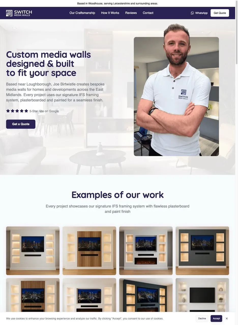
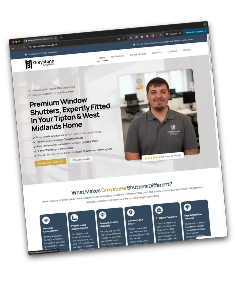
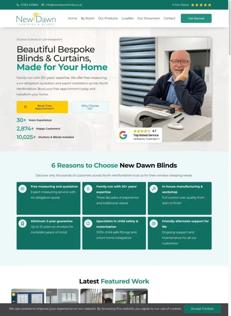
We build websites designed to turn visitors into real enquiries, with calls to action that make it easy for customers to call, book, or get in touch.
One-page website
Professional and high-converting, designed to get results fast.
From £399 + VAT
Ultimate website
Full multi-page site, available monthly or as a one-off payment.
From £99/mo + VAT
Also from £1,800 + VAT — pay in 3
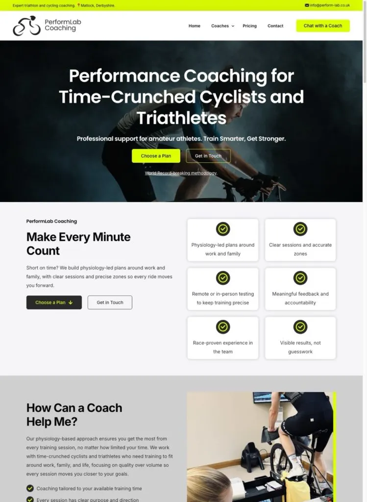
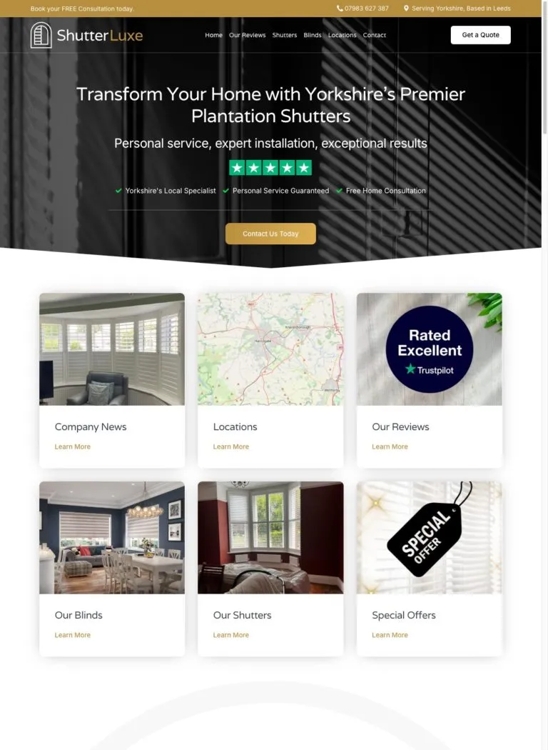
Lead generating
Built for trust
Grow faster
You run the business.
We’ll support the digital side.
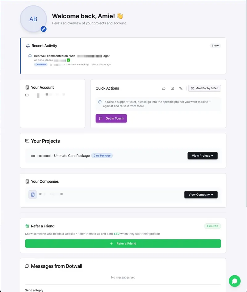
Think of us as your remote digital team. Websites, SEO, social media, AI tools, branding — we handle the digital side so you can focus on running your business.
- WordPress care packages from £35/mo — keeping your site fast, secure, and up to date
- Ad-hoc support from £50/hr — with discounts available for bulk hours
- Full transparency, everything logged and recorded in your own client portal
Website design
WordPress & Elementor
SEO
Local & national
AI tools
Agents, chatbots & apps
Social media
Content & strategy
Branding
Logos & identity
Website care
Updates & support
Client portal
Full transparency
WhatsApp support
Always on hand
AI web apps
Custom tools & portals
Website design
WordPress & Elementor
SEO
Local & national
AI tools
Agents, chatbots & apps
Social media
Content & strategy
Branding
Logos & identity
Website care
Updates & support
Client portal
Full transparency
WhatsApp support
Always on hand
AI web apps
Custom tools & portals
Need more website leads?
We create SEO strategies for your website, ensuring that you're put in front of more eyeballs, more search results, and more AI results to get you more leads from the right type of people. SEO leads are the most reliable intent leads you can get.
- Local SEO from £299/mo + VAT — the essential package for local businesses wanting to get found in their area
- Full SEO package from £599/mo + VAT — for businesses serious about growing their online presence and leads
- Full transparency included — all packages include set hours, logged and recorded in your client portal every month
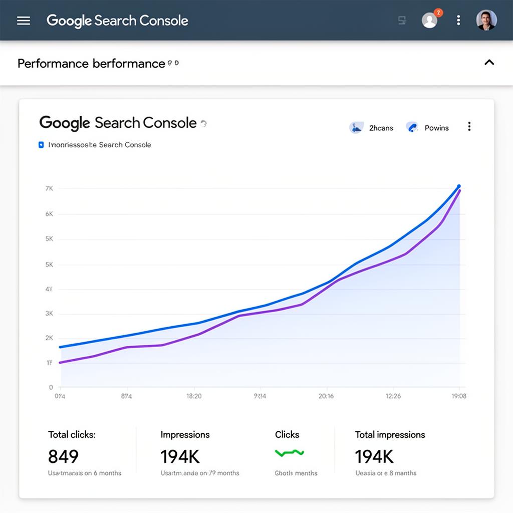
849
↑ from 442
Total clicks
194k
↑ from 100k
Impressions
+92%
↑ clicks growth
6 months

Using AI to help you!
We don't fight AI — we use it every day. From generating better images to writing faster, smarter content, we're always ahead of the tools, to help you.
- AI-generated imagery — better visuals for your site, faster and at a fraction of the cost of a photoshoot
- Smarter, faster content — AI-assisted copywriting that sounds like you, not a robot
- Always ahead of the tools — we test and adopt the best AI on the market so you benefit without the learning curve
We'll build your homepage for free.
You only pay if you love it.
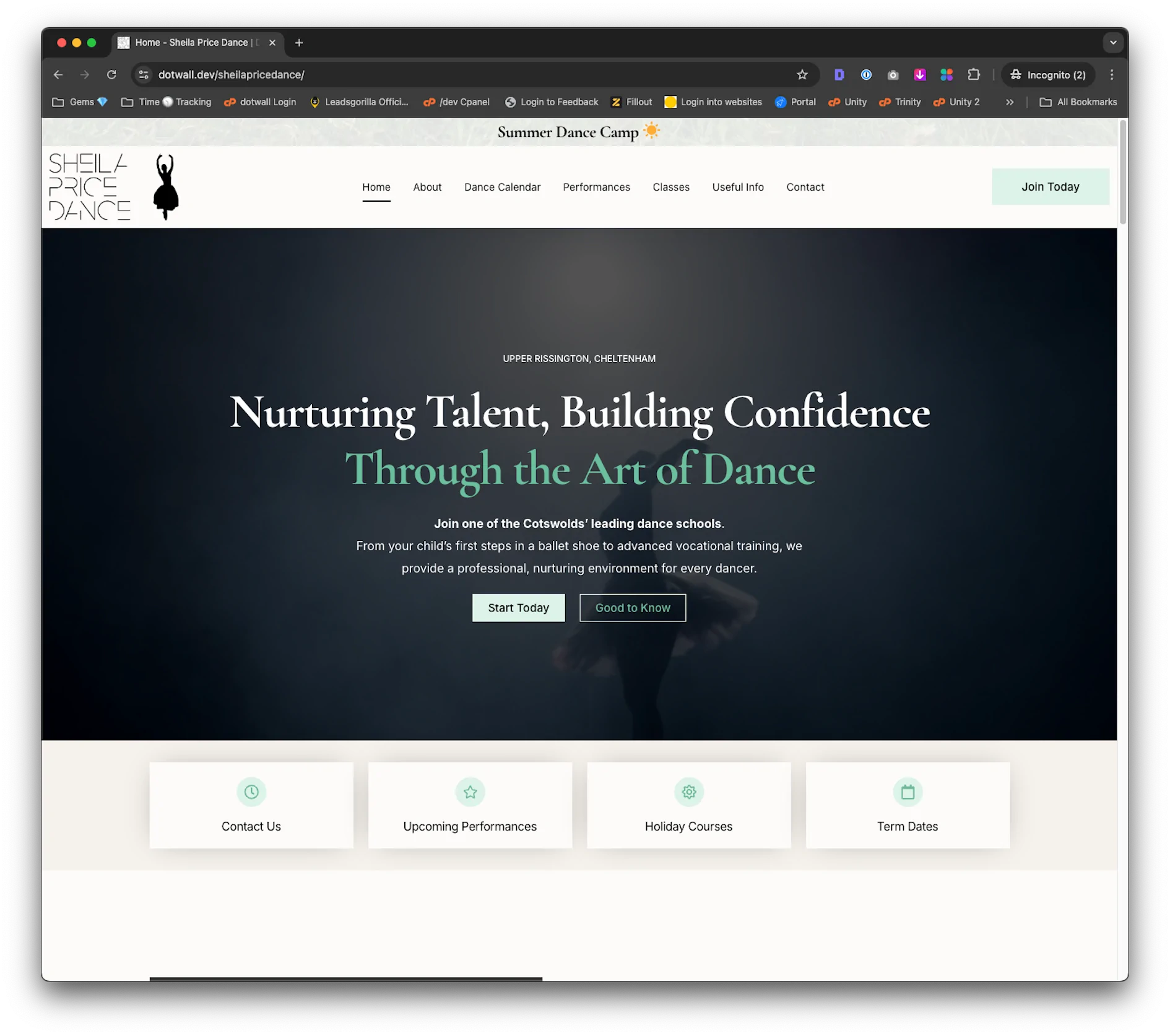
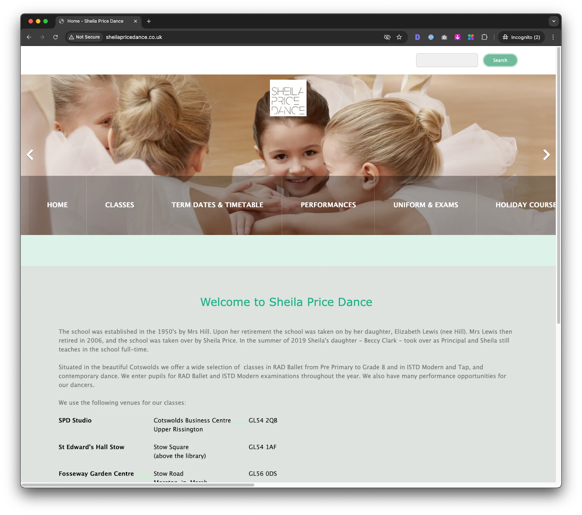
Drag to compare — real client, real result
- Free homepage preview — in 12 hours
- Video walkthrough included
- No payment, no commitment
We build your preview
Within 12 working hours
Love it or walk away
Zero obligation
Areas we serve
Based in Loughborough, working with businesses across the UK and beyond. We work 100% remotely — location is never a barrier.
dotwall.
Websites that work as hard as you do. Design, development & digital marketing for ambitious businesses.
Free resources
Get in touch

