

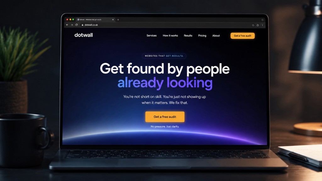
Quick answer: StoryBrand (Donald Miller) is a messaging framework that makes your customer the hero and your business the guide. We use it on almost every website we build because confused visitors do not enquire. Clear stories do. A StoryBrand-shaped homepage turns “who we are” noise into a path that leads to a call, a form, or a WhatsApp message.
Last updated: 24 July 2026.
What is the StoryBrand methodology?
StoryBrand is a practical way to organise how a business talks about itself. Instead of leading with “we are passionate industry leaders”, you lead with the person reading the page.
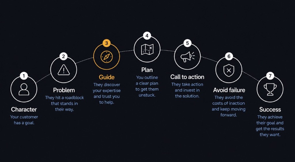
In StoryBrand terms, every clear message has seven beats:
- A character (your customer)
- Has a problem (external, internal, and often philosophical)
- Meets a guide (your brand — empathy plus authority)
- Who gives them a plan (simple steps)
- And calls them to action (one primary CTA)
- That helps them avoid failure
- And ends in success
That structure is ancient storytelling. StoryBrand’s value is forcing websites and sales pages to use it on purpose. For a plain overview of the storytelling ideas behind it, see Wikipedia on narrative structure and Miller’s own StoryBrand materials.
Why is it so good?
Because most small-business sites fail a basic test: can a stranger tell, in five seconds, what you do, who it is for, and what to do next?
StoryBrand is good because it:
- Kills jargon. If the hero would not say it, it does not go in the hero.
- Puts the customer first. Your awards still matter. They just sit in the “guide” role, not the lead role.
- Creates hierarchy. Headline, problem, plan, CTA — not a collage of equal-weight boxes.
- Makes design easier. When the message is clear, layout stops guessing.
It is not a magic font or a colour palette. It is a filter for what stays on the page.
Why is it captivating for the audience?
People do not arrive wanting your brand story. They arrive with a problem: a leaking roof, a bike that hurts, a website that does not bring leads, a drylining tender they need to look serious for.
A StoryBrand page mirrors how their brain already works:
- Recognition — “that is my problem”
- Relief — “someone gets it”
- Path — “here is what happens next”
- Stakes — “here is what I get if I act / what I risk if I wait”
That is why it feels captivating. It is not louder. It is more about them. Contrast that with sites that open on stock handshakes and “welcome to our website”. Nothing for the visitor to hold on to.
How does it help companies convert visitors into leads?
Conversion is rarely a clever button colour. It is clarity plus an obvious next step.
StoryBrand helps conversion because:
| StoryBrand beat | What the visitor experiences | Typical on-page result |
|---|---|---|
| Character + problem | “This is for me” | Hero headline names the outcome, not the company |
| Guide | “I can trust them” | Reviews, credentials, process, real photos |
| Plan | “This feels doable” | 3 clear steps (enquire → we build / fit / quote → you win) |
| CTA | “I know what to do” | One primary action: call, WhatsApp, form, book |
| Success / failure | “Worth acting now” | Outcomes and risk of staying stuck |
When those beats are missing, people bounce, scroll aimlessly, or open three tabs and never come back. HubSpot’s marketing benchmarks keep showing the same pattern year after year: inbound visitors who already recognise a need convert harder than cold outreach. StoryBrand is how you speak to that need on the page.
How we utilise it at dotwall
We do not print “StoryBrand™” on every mock-up. We use it as the brief behind the brief.
1. Free homepage first
Our free homepage mock-up is basically a StoryBrand stress test. Within 12 working hours we draft:
- Who the hero is
- The problem in their words
- Why you are a credible guide
- One primary CTA
If that lands, the full site builds out from the same spine.
2. Hero sections that answer, not decorate
On client sites and our own pages (website design, SEO, one-page websites), the first screen aims to answer:
- What is this?
- Who is it for?
- What should I do?
That is StoryBrand, applied with restraint. Brand still shows. Brand does not steal the lead role from the customer.
3. Plans and CTAs that match real behaviour
Trades want a call or WhatsApp. B2B buyers want a clear enquiry path. Bike fitters want “request a fit”. We design the plan and CTA to match how that audience already buys, then wrap it in clean UI. See recent launches like PSC Bikefit and Trent Valley Contracting for that pattern in the wild.
4. Copy and design move together
A beautiful layout with vague copy still fails. Strong StoryBrand copy on a slow, cluttered site also fails. We pair the messaging with fast Astro builds, mobile-first layout, and SEO so the people who find you can understand you and act.
Where StoryBrand is especially strong for web design
StoryBrand shines when:
- You sell a service, not a 400-SKU catalogue
- Trust matters (home visits, fittings, contractors, professional services)
- The visitor is busy and will not read a novel
- You need leads, not brand theatre
It is less about inventing a fantasy plot and more about stopping the site from talking about itself for three scrolls.
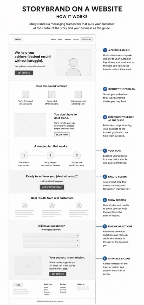
Good web design already cares about hierarchy, white space, and CTAs. StoryBrand gives those craft decisions a reason. The headline is large because the character’s desire must be unmistakable. The form is simple because the plan must feel easy. Reviews sit near the CTA because the guide needs proof.
What we avoid (even when it looks “on brand”)
- Opening with the company name as the hero
- Five competing CTAs above the fold
- Feature dumps with no problem stated
- Clever lines nobody understands on a phone in a hurry
- “Learn more” as the only next step when the real goal is an enquiry
If a section does not help the hero move toward success, it usually gets cut or demoted.
A simple StoryBrand checklist for your own site
Ask of your homepage:
- Can a stranger name the customer’s desire in one sentence?
- Is the problem obvious without industry jargon?
- Do we look like a guide (empathy + proof), not a rival hero?
- Is there a short plan (ideally three steps)?
- Is there one primary CTA?
- Is success concrete (more leads, pain-free rides, tender-ready presence)?
- Is failure acknowledged without scare tactics?
If you answer “no” to two or more, the design might be fine and the story still broken.
Sources
- StoryBrand (Donald Miller)
- Wikipedia — narrative structure
- Wikipedia — search engine optimisation (for how clear pages also help discovery)
- HubSpot marketing statistics
- Google Search Central — SEO starter guide
Want this on your site?
If your current homepage is all about you and somehow still quiet, that is usually a StoryBrand problem dressed up as a design problem. We use the same thinking on dotwall.co.uk itself: customer as the hero, clear problem, simple plan, and one obvious next step.
Grab a free homepage mock-up and we will sketch the hero through that lens, or get in touch if you already know the story needs rewriting.
StoryBrand FAQs
Straight answers on what StoryBrand is, why websites need it, and how we use it at dotwall.
What is the StoryBrand methodology?
StoryBrand is a messaging framework by Donald Miller. It positions your customer as the hero of the story and your business as the guide. The site clarifies their problem, offers a simple plan, calls them to act, and shows success (and what failure looks like if they do nothing).
Why does StoryBrand work so well on websites?
Most websites talk about the company. Visitors care about themselves. StoryBrand forces clear hierarchy, one obvious next step, and language that reduces confusion. Confused visitors leave. Clear visitors enquire.
How does StoryBrand help convert visitors into leads?
It removes noise. Hero, problem, guide, plan, and CTA sit above the fold or early on the page. Social proof and outcomes reinforce the story. The visitor always knows what to do next, usually call, WhatsApp, or submit a short form.
Do you use StoryBrand on every website?
Is StoryBrand only for big brands?
No. It is especially useful for trades, local services, and SMEs who cannot afford a muddled website. A plumber, bike fitter, or drylining contractor gains as much from clarity as a national brand.
No questions match your search. Try different keywords.