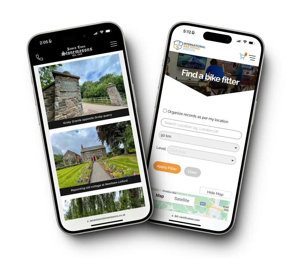
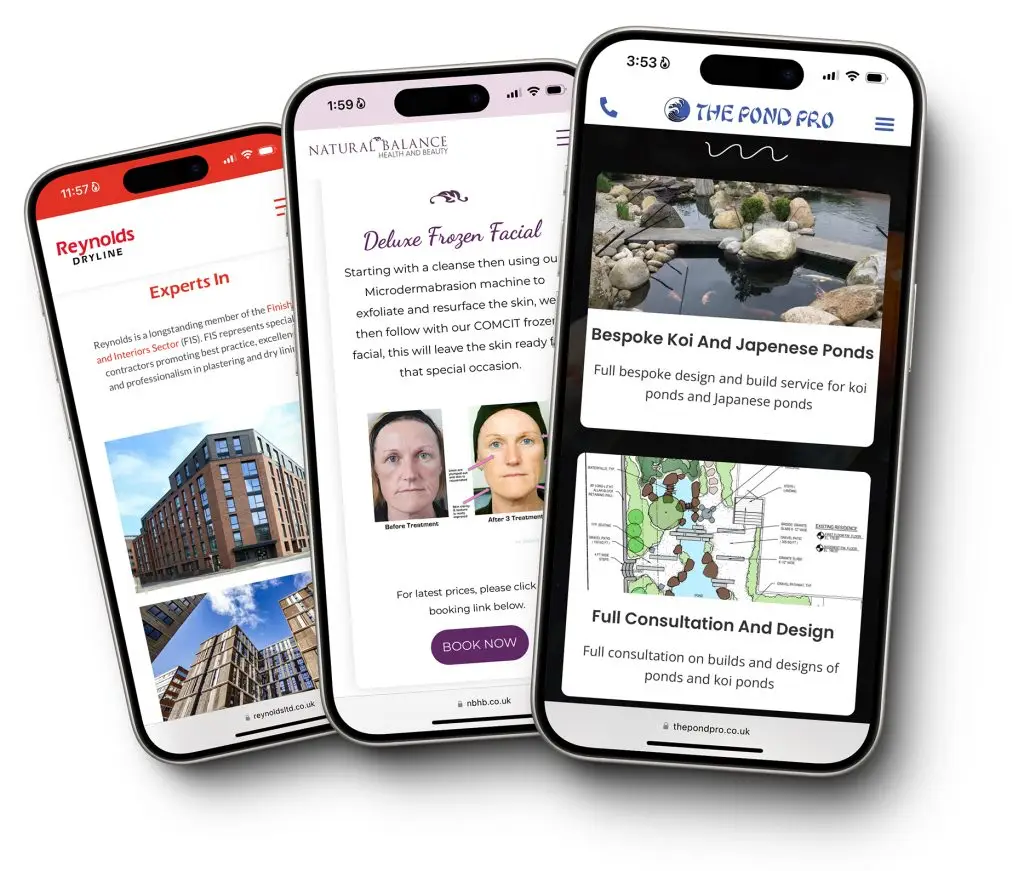
In today’s digital era, having a mobile-friendly website is crucial for businesses. With an increasing number of users accessing websites via smartphones and tablets, a mobile-optimised site ensures a seamless experience, leading to higher engagement and customer satisfaction. This article explores the importance of mobile-friendly design, providing practical tips and real-life examples to help businesses enhance their website performance.

Introduction
The shift towards mobile internet usage is undeniable. According to recent statistics, over 50% of global web traffic comes from mobile devices. For businesses, this means that having a website that looks great and functions well on mobile devices is not just an option but a necessity. A mobile-friendly website can significantly improve user experience, reduce bounce rates, and boost conversions. This article will delve into why mobile-friendly design matters and how businesses can implement it effectively.
Why Mobile-Friendly Design Matters
A mobile-friendly website is designed to load quickly and display correctly on smartphones and tablets. This involves responsive design, which adapts the layout to the screen size and orientation of the device. Here are some key reasons why mobile-friendly design is essential for businesses:

- Improved User Experience: A site that works well on mobile devices provides a better user experience, keeping visitors engaged and reducing frustration.
- Higher Search Rankings: Google prioritises mobile-friendly websites in search results, which can improve your site’s visibility and drive more traffic.
- Increased Engagement: Mobile users are more likely to interact with your content and take desired actions if the website is easy to navigate.
- Better Performance: Mobile-optimised sites load faster, reducing bounce rates and keeping users on your site longer.
Key Elements of Mobile-Friendly Design
Responsive Design
Responsive design ensures that your website adjusts its layout and content based on the device being used. This means images resize, text reflows, and navigation adapts to provide the best possible experience on any screen size.

Example: Imagine you are a retail company in Leicestershire that revamped their website with responsive design. Before the redesign, mobile users struggled with navigation and slow loading times. After implementing responsive design, you see a 40% increase in mobile traffic and a 25% increase in mobile sales within three months.
Optimised Loading Speed
Fast loading times are crucial for mobile users. Slow websites can frustrate users and lead to higher bounce rates. Optimising images, leveraging browser caching, and minimising redirects are effective strategies to improve loading speed.

Example: You run a local restaurant in Loughborough that has optimised your website for faster loading times. By compressing images and reducing unnecessary scripts, you’ve been able to decrease the page load time from 8 seconds to 2 seconds. This leads to a 50% increase in online reservations made via mobile devices.
Easy Navigation
Mobile users need simple and intuitive navigation. Clear menus, easily clickable buttons, and a straightforward layout can enhance the user experience.

Example: Imagine you manage a consultancy firm that had redesigned their website to feature a simplified navigation menu for mobile users. This change made it easier for potential clients to find information and contact your firm, resulting in a 30% increase in mobile enquiries.
Practical Tips for Mobile-Friendly Design
- Use Responsive Themes: Many website builders, including Elementor, offer responsive themes that automatically adjust to different screen sizes. Choose a theme that prioritises mobile optimisation.
- Optimise Images and Media: Use tools to compress images without sacrificing quality. Consider lazy loading for images to improve initial load times.
- Simplify Navigation: Use a clean and straightforward navigation menu. Avoid clutter and ensure buttons are large enough to be easily tapped.
- Test on Multiple Devices: Regularly test your website on various devices and screen sizes to ensure it looks and functions as intended.
- Prioritise Content: Keep content concise and relevant. Use headings, bullet points, and short paragraphs to make it easier for mobile users to read.
Conclusion
A mobile-friendly website is no longer optional; it’s a necessity for businesses aiming to succeed in today’s digital landscape. By implementing responsive design, optimising loading speeds, and simplifying navigation, businesses can significantly enhance their user experience, leading to higher engagement and better performance.
Value Addition
To truly benefit from a mobile-friendly website, businesses should continuously monitor and optimise their sites. Regular updates and improvements based on user feedback and analytics can ensure the website remains effective and competitive. Additionally, investing in professional web design services can provide expert insights and solutions tailored to your business needs.

By prioritising mobile-friendly design, businesses can attract and retain more customers, ultimately driving growth and success in an increasingly mobile-first world.


