What is Google’s Chrome Extension page?
Below, I’ve listed several reasons why I dislike the current Google Chrome extensions page. Following these critiques, I present my suggested improvements and include a screenshot of a quick mockup I created in just 13 minutes to demonstrate these enhancements. The mockup shows how simple changes could make the page much more user-friendly and intuitive. Do you think this page needs urgent improvement? Share your thoughts in the comments below.

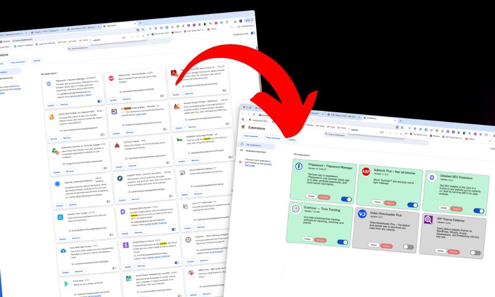
So, what’s What's my beef? 🤬
The extension order doesn't make sense
Currently, extensions are arranged alphabetically, starting with numerical plugins like 1Password before moving through the alphabet. While this makes some sense, it’s not the most practical approach. A better system would list active extensions first, followed by inactive ones—both groups in alphabetical order.

Visually hard to look at
The page’s visual design makes it difficult to scan. At a glance, I can’t easily tell which extensions are active or inactive. I have to strain my eyes and scan the entire page just to find specific extensions, determine their status, and then take action on them.
Lack of colour
The page completely lacks color. It’s just black and white, with tiny icons representing each installed extension. In my view, this makes for a terrible user experience.

My solutions ✅
These solutions are straightforward; I’m sure someone at Google could make these changes in hours. Please, Google, here are my solutions.
Colour-coded
I propose implementing a color-coding system to make extension status immediately visible. For active extensions, I suggest using a green background color that would allow users to instantly identify which extensions are enabled. While I acknowledge there could be accessibility considerations when using green as an indicator, some form of visual differentiation through colour would significantly improve the user experience.
In my quick mockup below, I’ve demonstrated this concept by using distinct background colours: green for active extensions and grey for inactive extensions. This simple visual enhancement makes it much easier to scan and understand the status of multiple extensions at once, rather than having to carefully read through each entry.
Although this is a basic implementation that would need further refinement to address accessibility concerns, it illustrates how even a straightforward color-coding system could dramatically improve the usability of the extensions page. The contrast between active and inactive states provides immediate visual feedback, helping users manage their extensions more efficiently.

Active extensions listed first
This is the most important change I’m suggesting: Extensions should be organised by status first, then alphabetically within each group. Active extensions should be listed first in alphabetical order, followed by inactive extensions, also in alphabetical order.
Make the toggle easier to see
In my example, I’ve made the toggle switch larger. This makes it easier to see at a glance and simplifies toggling extensions on or off.

Simplification
I’ve simplified the text elements on the screen. Google currently puts the extension title and version number on the same line, but we don’t really need to see the version number at first glance. If needed, users can find this information in a line below. Each extension box should simply show the extension name, a brief description, and “Details” or “Learn More” buttons. This allows users to open a popup window for more detailed information. For example, the current setup displays extension IDs—
ID: cfhdojbkjhnklbpkdaibdccddilifddb’
While this might mean something to developers, it’s meaningless to the average user. As a web developer myself, I’ve never needed to use these IDs, so they should be removed entirely. Instead, I’ve prioritised showing the title and placed the version number in smaller text below to create a clear text hierarchy. I’ve also added simple “Details” and “Remove” buttons along with the toggle switch. This streamlined design eliminates unnecessary complexity.
Dear Google, please sort this
My re-design