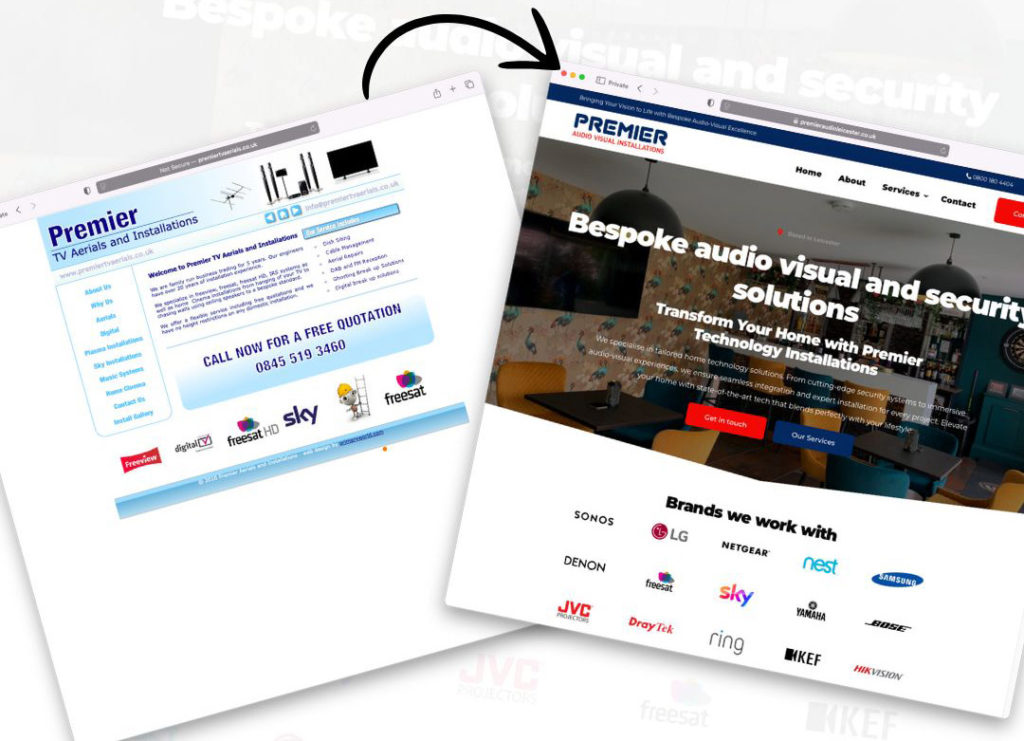
When Premier Audio & Visual Leicester approached us, they had a website that had served them well back in the day but no longer matched the standards of modern web design. Built in HTML, the old site was functional but lacked the sleek, dynamic feel that users expect today. We set out to create a website that not only looked fantastic but also delivered a seamless experience across devices. Check out the live site here!
Key Improvements:
Visual Overhaul
We gave the site a clean, contemporary design, reflecting Premier Audio & Visual’s expertise in high-end audio and visual installations.
Enhanced Navigation
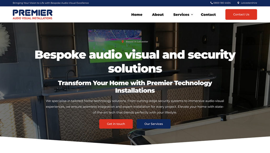
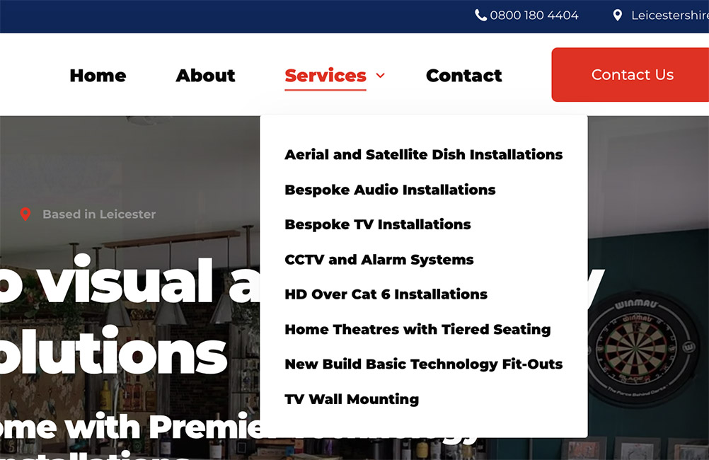
A simplified main menu with clear sections for “Home,” “About,” “Services,” and “Contact,” as well as individual service pages, makes finding information a breeze.
Strong Call-to-Actions
Bold, red buttons direct users to get in touch easily.

Brand Representation
Updated logos and colour scheme (blue and red) flow consistently throughout the site, reinforcing brand identity.
Credibility Elements
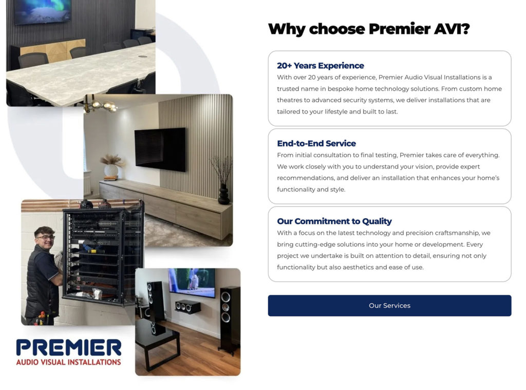
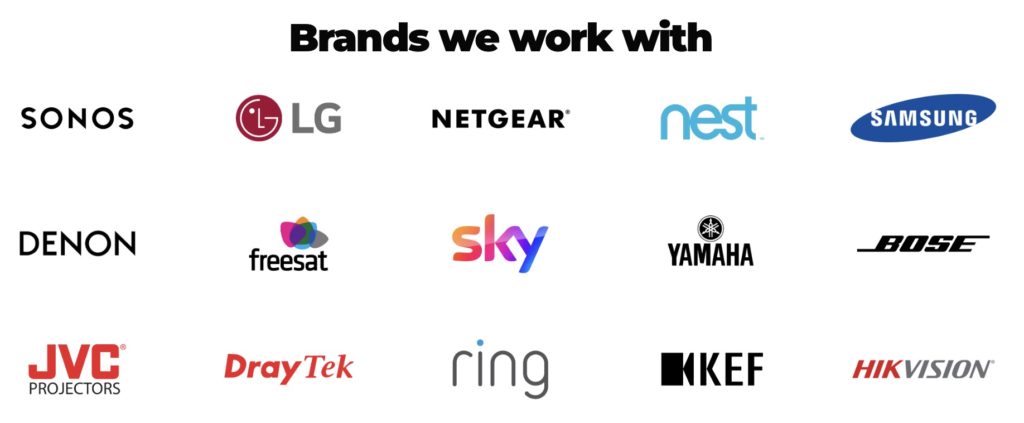
Showcased the brands Premier works with and real project images, adding authenticity and professionalism.
Mobile Optimisation
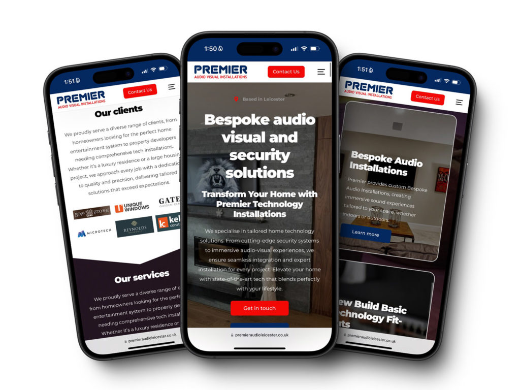
The new design is fully responsive, ensuring a flawless experience on all devices.
Premier Audio & Visual’s new site doesn’t just look great; it’s a powerful tool for attracting new clients, presenting their expertise in both residential and commercial installations, from home theatre setups and multi-room audio to Cat5/Cat6 networking and commercial AV solutions.
Thinking about a website upgrade? Apply for a FREE homepage mockup today!

