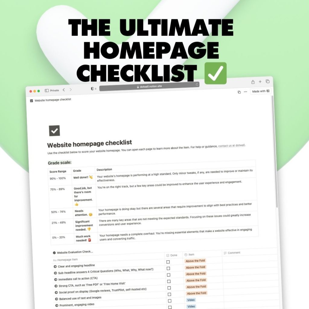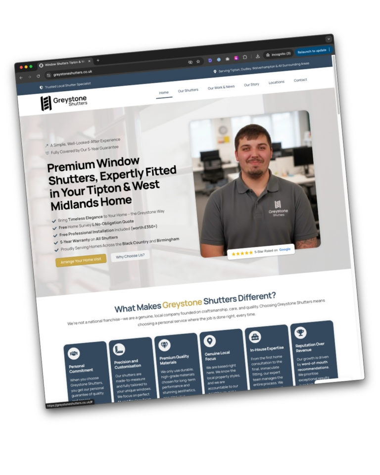
This is a notion template; once you’ve opened the page, click copy (or duplicate) to make it your own 👍
Your website’s homepage is the digital front door of your business. It’s where first impressions are made, and you only have a few seconds to grab a visitor’s attention. That’s why we’ve created this Website Homepage Checklist—a simple, practical tool to help you evaluate your homepage’s effectiveness and make improvements where needed.
The checklist is designed to help you assess and score your homepage out of 100%, breaking down crucial elements like navigation, layout, calls to action (CTAs), and SEO-specific requirements.
What’s Included in the Checklist?
This checklist covers all the key elements that make a homepage engaging and conversion-friendly, including:- Above the Fold Essentials:
- A clear and engaging headline
- Sub-headline answering 4 critical questions (Who, What, Why, What Now?)
- Immediate call to action (CTA)
- Social proof and trust signals (e.g., reviews, TrustPilot badges)
- Balanced text and images
- Visual Elements:
- High-quality images of your business or team
- Video that enhances your message
- Human elements to build connection and trust
- Navigation:
- Clear, uncluttered navigation to guide visitors smoothly
- Prominent logo and visible main CTA in the top right corner
- Key Calls to Action:
- At least 2 strong CTAs both above and below the fold
- Simple and compelling CTAs to drive conversions
- Trust Signals:
- Links to customer reviews, testimonials, and industry certifications
- Awards, badges, and logos to reinforce credibility
- Contact information, privacy policy, and terms of service easily accessible
- SEO-Specific Elements:
- Proper use of heading tags (H1, H2, H3, etc.)
- Main H1 tag includes your business’s focus keyword
- Links to your Google Business profile and other directories
- Analytics tracking installed to measure performance
How Does the Scoring Work?
- 90% – 100%: Well done! Your homepage is performing at a high standard with only minor tweaks needed to maintain its success.
- 75% – 89%: Good job, but there’s room for improvement! A few key areas could be enhanced to improve user experience and engagement.
- 50% – 74%: Needs attention. Your homepage is functional but missing several crucial elements that require improvement.
- 25% – 49%: Significant improvement needed. Many areas are not meeting expected standards, and focusing on these can increase conversions.
- 0% – 24%: Much work needed. A complete overhaul is required to make the site engaging and effective.


