In the digital age, a website is often the first point of contact between a business and its potential customers. A well-designed website not only attracts visitors but also ensures they stay longer, engage with the content, and return in the future. The layout of your web pages plays a crucial role in delivering a seamless and enjoyable user experience. This article explores how to create an effective page layout by prioritising visual hierarchy and maintaining consistency.
Introduction
An effective page layout is essential for any business looking to establish a strong online presence. It impacts user engagement, retention, and ultimately, conversion rates. By focusing on visual hierarchy and consistency, businesses can create a user-friendly environment that guides visitors through their journey effortlessly.
Prioritise Visual Hierarchy

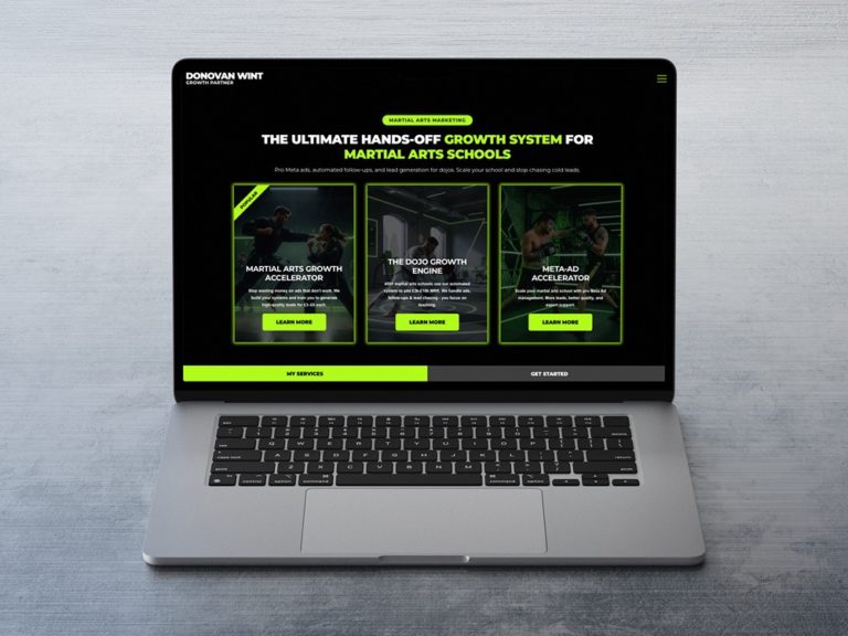
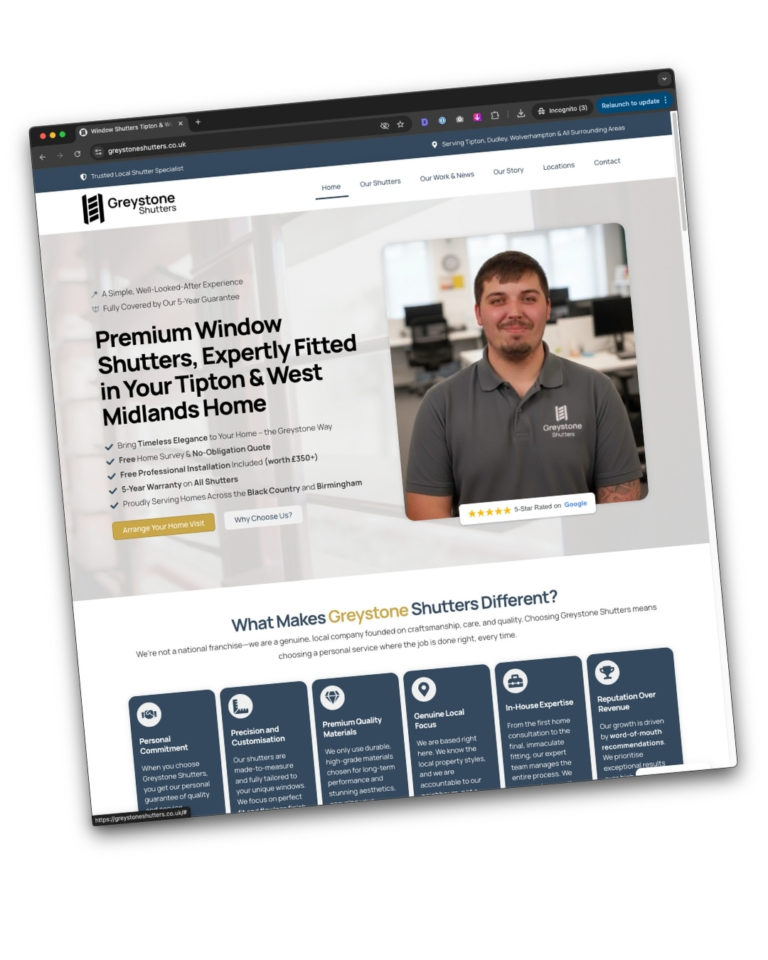
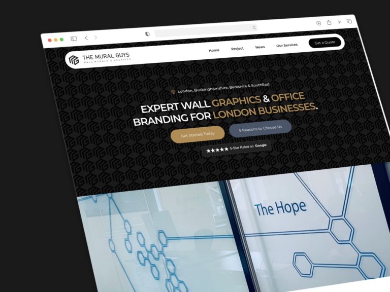
Visual hierarchy refers to the arrangement of elements on a page in a way that signifies their importance. A clear visual hierarchy helps users navigate your website intuitively, making it easier for them to find the information they need.
Clear Headings and Subheadings
Headings and subheadings are vital for breaking up content and making it scannable. For instance, Apple’s website uses bold, large fonts for headings and smaller, less prominent fonts for subheadings. This technique guides the user’s eye to the most important information first.
Use of Size, Colour, and Placement
The size of elements can indicate their significance. Larger elements draw more attention. For example, on the BBC News website, the main headlines are significantly larger than other text, ensuring they catch the reader’s eye first.
Colour can also be used to create contrast and highlight important areas. The NHS website uses blue for links and buttons, standing out against the white background, making navigation intuitive.

Placement is another crucial aspect. Important information should be placed where users naturally look first, typically the top left of the page. For example, Amazon places key navigation links and the search bar at the top, making them easily accessible.
Maintain Consistency
Consistency in design helps build familiarity and trust, making it easier for users to interact with your site. This involves using the same fonts, colours, and design elements across all pages.
Fonts and Colours
Using a consistent font throughout your website helps maintain a professional look. Google’s Material Design guidelines suggest using no more than three typefaces in a maximum of three sizes to keep the design clean and readable.

Colours should also be used consistently. For instance, Starbucks uses its signature green across its website, creating a cohesive and recognisable brand identity.
Design Elements
Design elements such as buttons, icons, and menus should have a uniform style. The simplicity of Dropbox’s design, with consistent iconography and button styles, enhances the user experience by reducing cognitive load.
Real-life Examples
Let’s take a closer look at some real-life examples where businesses have effectively used visual hierarchy and consistency to enhance user experience.
Example 1: Airbnb

Airbnb’s website is a prime example of effective use of visual hierarchy. The homepage features a large, inviting search bar at the top, guiding users to start their booking journey immediately. The use of high-quality images and consistent fonts across the site makes navigation seamless.
Example 2: Slack

Slack maintains a consistent design throughout its website, with a focus on simplicity and clarity. The consistent use of colours and fonts helps users quickly find the information they need. The placement of call-to-action buttons is strategic, guiding users through the site effortlessly.
Example 3: Spotify

Spotify’s website uses bold, vibrant colours and large typography to create a dynamic visual hierarchy. The consistency in design elements across different pages ensures that users have a familiar experience as they navigate the site.
Conclusion
Creating an effective page layout is about more than just aesthetics. It involves strategic use of visual hierarchy and consistency to enhance user experience. By organising content with clear headings, using size, colour, and placement effectively, and maintaining consistency in design elements, businesses can create a user-friendly website that keeps visitors engaged and satisfied.
Practical Tips for Businesses
- Audit Your Current Design: Review your website to identify areas where visual hierarchy and consistency can be improved.
- User Testing: Conduct user testing to gather feedback on the usability of your site.
- Iterate and Improve: Use the insights from user testing to make iterative improvements to your design.
- Stay Updated: Keep abreast of the latest web design trends and best practices to ensure your website remains effective.
Enhancing user satisfaction with a well-structured layout is a continuous process. By prioritising visual hierarchy and maintaining consistency, businesses can create a compelling online presence that not only attracts visitors but also converts them into loyal customers.