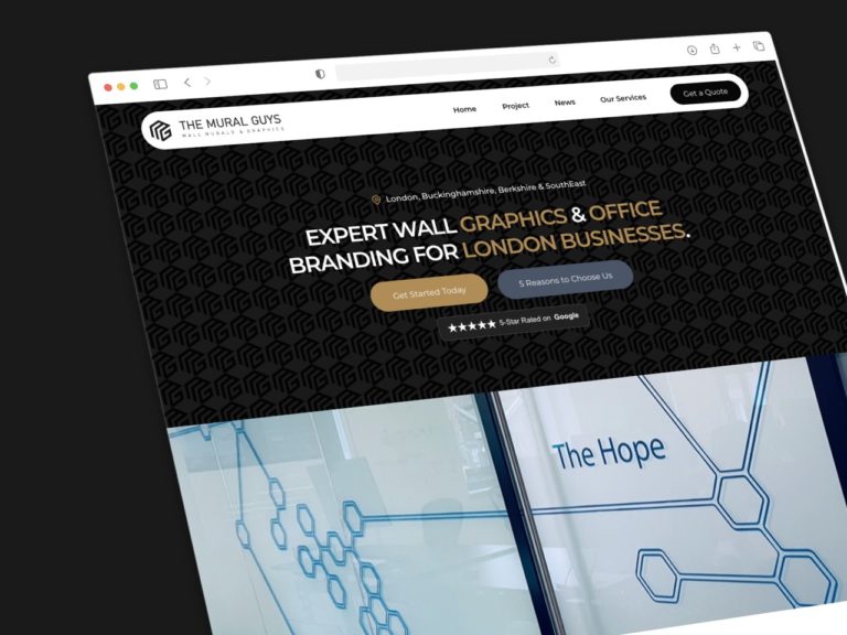
In the dynamic world of web design, standing out is crucial. One way to create a visually striking website is through asymmetrical layouts. These designs break away from traditional symmetry, offering a fresh and engaging user experience. However, this approach isn’t without its challenges. Businesses need to balance creativity with usability to ensure they capture attention without confusing visitors. This article explores the pros and cons of asymmetrical layouts, providing real-life examples and actionable insights for businesses looking to innovate their web design.

The Pros of Asymmetrical Layouts
1. Dynamic and Unique Visual Appeal
Asymmetrical layouts are inherently eye-catching. By breaking the monotony of symmetrical design, they create a sense of movement and interest that can draw users in. This dynamic visual appeal is particularly effective for brands looking to make a bold statement.
Example: The website for ‘ETQ Amsterdam‘, a luxury sneaker brand, utilises an asymmetrical layout to highlight their minimalist design ethos. The irregular placement of images and text creates a modern, edgy feel that aligns perfectly with their brand identity.

2. Encouraging User Engagement
Asymmetrical designs can guide users through a website in a more engaging manner. By strategically placing elements, designers can create a flow that leads visitors from one section to another, enhancing the overall user experience.
Example: ‘Dropbox‘ employs asymmetry to great effect on their homepage. The staggered placement of images and text blocks keeps the viewer’s eye moving, effectively communicating their value propositions without overwhelming the user.

3. Enhancing Brand Identity
A well-executed asymmetrical layout can reinforce a brand’s unique identity. It allows businesses to break away from traditional templates and create a distinctive online presence that resonates with their target audience.
Example: ‘Apple‘ effectively uses asymmetrical layouts on its product pages. By strategically placing large, high-quality images of their products alongside concise text blocks, Apple creates a visually engaging and modern look. This design choice highlights their brand’s focus on innovation and simplicity. The off-centre elements draw attention to key product features, reinforcing Apple’s identity as a leader in sleek, cutting-edge technology. This approach not only enhances visual appeal but also aligns perfectly with their brand ethos.

The Cons of Asymmetrical Layouts
1. Balancing Complexity
One of the biggest challenges of asymmetrical layouts is achieving balance. Poorly executed asymmetry can result in a chaotic, disorganised appearance that confuses users rather than engaging them.

Insight: It’s crucial to maintain visual harmony by carefully considering the placement and size of each element. Using a grid system can help manage this complexity, ensuring that the design remains cohesive.
2. Potential for User Confusion
If not done well, asymmetrical layouts can lead to a disjointed user experience. Users might struggle to find important information or understand the site’s navigation, leading to frustration and increased bounce rates.

Example: A study by the Nielsen Norman Group found that users prefer predictability in website navigation. When experimenting with asymmetry, it’s vital to ensure that key elements like menus, calls to action, and contact information are easy to locate and interact with.
3. Increased Design Time and Cost
Creating an effective asymmetrical layout often requires more time and expertise than traditional symmetrical designs. This can result in higher costs for businesses, especially if they need to hire specialised designers to achieve the desired effect.

Insight: To mitigate this, businesses can start with a hybrid approach, incorporating subtle asymmetrical elements within a largely symmetrical framework. This allows them to test the waters without a significant investment.
Balancing Creativity and Usability
To leverage the benefits of asymmetrical layouts while minimising their drawbacks, businesses should focus on the following strategies:
1. Prioritise User Experience

Always design with the user in mind. Ensure that the layout, while creative, does not hinder usability. Conduct user testing to gather feedback and make necessary adjustments.
2. Use a Focal Point
Create a clear focal point to anchor the design. This helps guide the user’s eye and provides a starting point from which they can navigate the rest of the site.
3. Maintain Visual Hierarchy
Ensure that there is a clear visual hierarchy in place. Important elements should stand out, guiding users naturally through the site. Use contrast, colour, and spacing effectively to achieve this.
4. Be Consistent
While asymmetry can be exciting, consistency is key to a user-friendly design. Maintain a consistent style and pattern across the site to avoid confusing users.
5. Simplify Navigation

Keep navigation simple and intuitive. Even within an asymmetrical layout, users should easily find their way around. Sticky menus, clear call-to-action buttons, and a logical flow can help achieve this.
Conclusion
Asymmetrical layouts offer a powerful way to differentiate a website and engage users through dynamic and unique visual appeal. However, they require careful consideration and expertise to balance creativity with usability. By prioritising user experience, using focal points, maintaining visual hierarchy, ensuring consistency, and simplifying navigation, businesses can create compelling, effective asymmetrical designs. Ultimately, the key is to experiment thoughtfully, always keeping the end user in mind.
By embracing these strategies, businesses can not only capture attention but also provide a seamless and enjoyable user experience, driving engagement and achieving their online goals.


