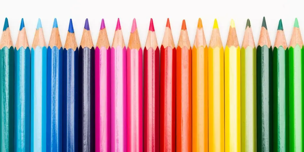
Colours can evoke emotions that help build a connection with your audience. Warm colours can create a sense of excitement, while cool colours can be calming. In web design, the strategic use of colour can make a significant difference in how users perceive and interact with your website. At dotwall Web Design, we understand the power of colour psychology and how it can be used to enhance user experience and engagement. Let’s explore how you can use colours to create emotional connections with your audience.
The importance of colour in web design
Colour is more than just a visual element; it’s a vital aspect of branding and user experience. The suitable colour scheme can:
- Evoke specific emotions and moods
- Enhance brand recognition
- Guide user behaviour and decisions
- Improve readability and accessibility
By understanding the psychological effects of colours, you can design a website that not only looks appealing but also resonates with your audience on a deeper emotional level.
Example: McDonald's

McDonald’s uses a combination of red and yellow in its branding and website design. The red evokes excitement and passion, while the yellow adds a sense of cheerfulness and optimism. This colour scheme aligns perfectly with McDonald’s brand image of fast, fun, and family-friendly dining. The use of these warm colours helps create an inviting and energetic atmosphere that appeals to their target audience.
Cool colours: Calm and trust
Cool colours like blue, green, and purple are associated with calmness, trust, and professionalism. These colours are often used by brands that want to convey reliability and stability, such as those in the healthcare, finance, and technology sectors.
Example: Facebook
Facebook’s use of blue is a classic example of how cool colours can be used to build trust and convey professionalism. Blue is associated with trust and dependability, which is essential for a social media platform where users share personal information. The calming effect of blue helps create a sense of security and reliability, encouraging users to spend more time on the platform .

Combining colours for maximum impact
While individual colours have their own psychological effects, combining them strategically can amplify their emotional impact. Here are some tips on how to effectively use colour combinations in your web design:
Complementary colours
Complementary colours are opposite each other on the colour wheel (e.g., blue and orange). Using complementary colours can create a vibrant and dynamic look, making key elements stand out and drawing the user’s attention to important information.
Example: HubSpot
HubSpot uses a combination of blue and orange in their branding and website design. This complementary colour scheme creates a dynamic and energetic look that captures attention. The blue conveys trust and professionalism, while the orange adds a sense of enthusiasm and creativity. This combination helps highlight important calls-to-action and guides users through the website effectively .

Analogous colours
Analogous colours are next to each other on the colour wheel (e.g., blue, blue-green, and green). These colours create a cohesive and harmonious look, often used to evoke a specific mood or atmosphere.
Example: Starbucks
Starbucks uses shades of green in their branding and website design, creating a calming and refreshing atmosphere. Green is associated with nature and health, aligning with Starbucks’ focus on sustainability and quality. The use of analogous colours helps create a cohesive and inviting look that appeals to their environmentally conscious customers .

Conclusion
Incorporating the right colours into your web design can significantly enhance the emotional connection with your audience. By understanding the psychological impact of colours and using them strategically, you can create a website that not only looks aesthetically pleasing but also resonates with your visitors on a deeper level. Whether you’re looking to evoke excitement with warm colours or build trust with cool hues, the key is to align your colour choices with your brand’s message and your audience’s expectations.
Need help with your business’s colors and branding? Get in touch today. We also offer a free one-on-one meeting to discuss anything, such as your brand colours. And remember, we offer a free homepage markup when you apply today for your new website, completely risk-free.