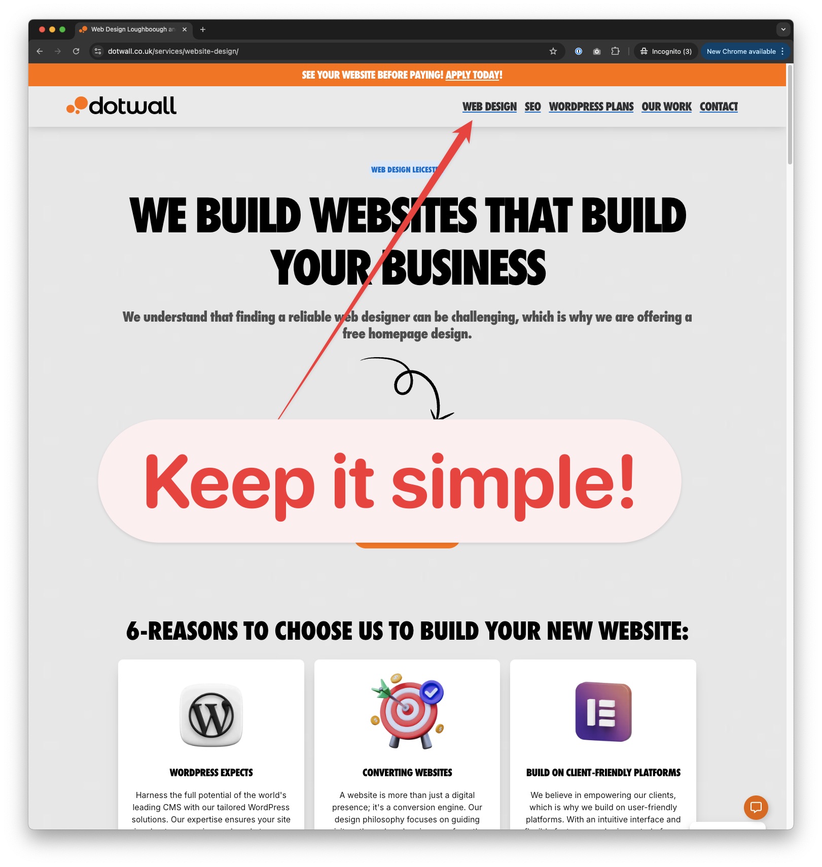
When it comes to web design, the importance of clean and straightforward navigation can’t be overstated. Your main menu is the backbone of your website’s user experience—it’s the roadmap that helps visitors explore your content and, most importantly, find what matters most. Keeping your navigation simple eliminates distractions, guiding users to key revenue-generating pages that drive conversions and support your business goals.
In this blog post, we’ll look at why maintaining clear and uncluttered navigation is crucial and how it directly impacts your website’s success.

1. Improved User Experience
A streamlined, clutter-free navigation makes it easier for visitors to find what they’re looking for, improving the overall user experience. When users can easily locate the content they need, it reduces their frustration and the likelihood of them abandoning your site. Clear navigation means fewer clicks, quicker access to information, and a happier user—all of which reduce bounce rates and increase time spent on your website.
2. Increased Conversions
By prominently featuring your high-value pages (such as product listings, contact forms, or service pages) in a clean and organised menu, you increase the chances that visitors will reach these critical areas. When your navigation is cluttered with too many choices, users might miss these money-making pages. A focused menu means users are more likely to engage with the content that drives your revenue.
3. Enhanced Focus on Key Offerings
When users land on your website, they should immediately understand where to go to learn about your services or products. A clear navigation system helps direct their attention to what matters most—your key offerings. By reducing menu clutter, you ensure that users aren’t distracted by secondary information, which might lead them away from your main goals, like purchasing a service or signing up for a consultation.
4. Faster Decision Making
The more options a user has, the longer it takes them to decide. This is known as decision fatigue, which can negatively impact your website’s performance. Users may get overwhelmed and leave the site when your main menu is packed with too many links. On the other hand, a simple, clean navigation makes it easy for visitors to decide where to go next, leading to a faster, more efficient journey through your site.
Pro Tip: Regularly Review and Optimise
Navigation is not a “set it and forget it” aspect of your website. As your business evolves, so should your menu structure. Regularly review your navigation to ensure it remains focused on your most important pages and reflects your business priorities. Remove or hide any outdated or irrelevant pages that no longer contribute to your goals. This not only keeps your site clean but also helps improve the user experience over time.
Final Thoughts
Your website’s navigation is more than just a list of links—it’s a tool for guiding visitors toward taking action, whether that’s purchasing a product, booking a service, or contacting your team. By keeping your main menu clear, concise, and aligned with your business objectives, you create a better user experience, increase conversions, and ultimately support your bottom line.
Make sure every item in your main navigation serves a purpose. The fewer distractions, the more focused your users will be, helping them connect with the most important parts of your site—and driving your business forward.


