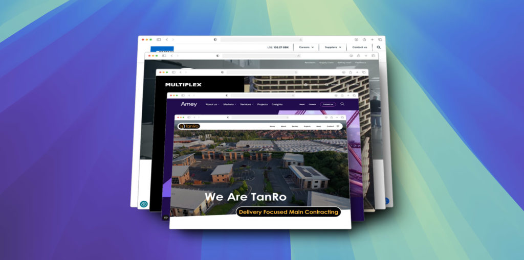
A construction company’s website is often the first point of contact with potential clients. A well-designed site not only makes a great first impression but also communicates professionalism, trustworthiness, and expertise. In this list, we’ll highlight five of the best construction company websites, with special mention of Tanro, which was designed by dotwall. To clarify, dotwall only designed Tanro’s website, and the other sites were developed by their respective companies.
1. Amey – amey.co.uk
Highlight: Interactive Navigation and Accessibility
Amey’s website places a strong emphasis on user accessibility and ease of navigation. The site’s structure is intuitive, with clearly defined sections and a responsive design that works seamlessly across all devices. This type of navigation is crucial for a construction company because visitors often come with specific goals, such as searching for project details, services, or contact information.

Why It Works: The clean navigation helps users find what they need quickly, reducing frustration and keeping them engaged. In construction, where many visitors are hunting for detailed information, this ease of use enhances the customer experience. Amey’s focus on accessibility ensures potential clients have a smooth browsing experience, improving the chance they’ll take further action.
2. Wates – wates.co.uk
Highlight: Visual Storytelling with Project Showcases
Wates prioritises visual storytelling, displaying high-quality images of its projects prominently on the homepage. As visitors scroll, they encounter detailed case studies that highlight the company’s extensive work in sectors such as residential, commercial, and public sector builds.

Why It Works: In construction, visuals matter. Clients want to see what you can deliver, and Wates uses imagery and project showcases to build immediate credibility. This focus on visually appealing, project-based content not only engages visitors but also demonstrates the company’s capabilities effectively, giving potential clients confidence in their expertise.
3. Tanro – tanro.co.uk
Highlight: Clean and Direct Layout with Focus on Services
Designed by dotwall, Tanro’s website is a perfect example of functional simplicity. The site offers a streamlined user experience where visitors can quickly find information about Tanro’s services in industrial groundworks and construction. The homepage is clean and easy to navigate, with clear calls-to-action (CTAs) that prompt visitors to request quotes or make contact directly.

Why It Works: Construction clients often need specific information, and they need it fast. Tanro’s site avoids unnecessary clutter and presents information in a clear, concise manner. By balancing visuals and text, the design communicates expertise while also encouraging user interaction. The smooth navigation and well-placed CTAs lead to higher engagement and ensure users can easily get in touch.
4. Costain – costain.com
Highlight: Corporate Responsibility and Sustainability Focus
Costain’s website is notable for its emphasis on sustainability and corporate responsibility. Right from the homepage, visitors can access the company’s latest sustainability reports and find information on its environmental and social contributions. This is a forward-thinking approach, especially in an industry where green practices are becoming increasingly important.

Why It Works: In today’s market, showcasing a commitment to sustainability can give companies a competitive edge. Costain’s dedication to corporate responsibility appeals to clients who value environmental and social impact. By featuring sustainability prominently, they demonstrate their leadership in the industry while aligning with modern consumer values, making them more attractive to conscious clients.
5. Multiplex – multiplex.global
Highlight: Sleek, Modern Design with a Focus on Innovation
Multiplex stands out thanks to its sleek, modern design. The dark, polished visuals create a professional, high-end feel, but the site goes beyond aesthetics. It highlights the company’s focus on innovation, with a dedicated section on digital engineering and sustainability technologies. This emphasis on cutting-edge practices aligns with the company’s brand identity as a leader in modern construction techniques.

Why It Works: A modern design reflects Multiplex’s commitment to innovation, appealing to clients looking for a forward-thinking partner. The slick design isn’t just about looking good—it communicates the company’s ability to deliver complex, tech-driven projects. This combination of design and technology positions Multiplex as a standout in the construction industry.
Final Thoughts
Each of these construction companies has made strategic design choices that enhance their credibility and appeal to potential clients. Tanro’s website, designed by dotwall, excels in providing a straightforward, user-friendly experience, while the other companies highlight their unique strengths through features like sustainability, project showcases, and innovation. If you’re considering a redesign for your own construction company’s website, these examples offer plenty of inspiration—because a well-designed site doesn’t just look good, it drives results.
For more useful incites from dotwall, sign up to our newsletter to get a dose of the best content.