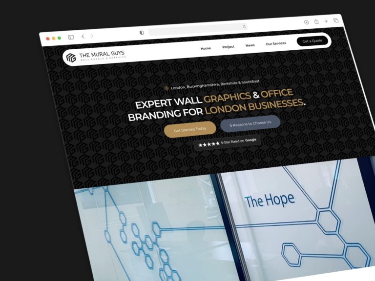
When it comes to creating a brochure-style website, the hero section is the first thing your visitors will see when they land on your site. This section, often referred to as “above the fold,” is crucial because it dominates the top of the page and grabs the viewer’s attention within the first three seconds. In this brief moment, visitors should be able to identify what your business does, where you’re based, and why they should stay on your website.
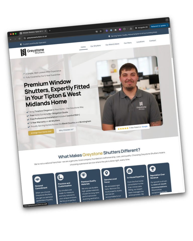
The key to a great hero section lies in ensuring you have a clear call-to-action (CTA), a compelling image, and strong social proof. Let’s break down the elements of an effective hero section using the example provided above.
1. Logo Placement
Location: Ensure your logo is simple and works well in a horizontal format. Place it in the top left, top right, or center of your website for maximum visibility.
Tip: The logo should be easy to spot and not overly complicated, helping to reinforce brand recognition immediately.
2. Simplified Menu
Essentials Only: Your menu should be simplified to include only the most crucial items. Think about what your visitors are most likely to want to see, such as services, home, or contact pages.

Tip: Avoid clutter. Too many menu options can overwhelm visitors and distract them from taking action.
3. Primary Call-to-Action (CTA)
Design and Placement: Your primary CTA should be highly visible and use your brand’s primary colour. It should stand out on the page, drawing the visitor’s eye immediately.
Purpose: This CTA should guide visitors towards the main action you want them to take, such as contacting you, filling out a form, or downloading a valuable resource in exchange for their email address.
Example: A great incentive could be offering a free homepage mock-up, allowing potential clients to see the value you provide before making a commitment.
4. Main Headline (H1)
Content: This is the most important text on your page, known as the H1 title. It should clearly state what your business does and the problem it solves for your customers.

Focus: Keep the headline concise and focused on solving the customer’s problem rather than talking about yourself.
Example: “We help small to medium businesses get online and sell more!” This headline tells visitors who you help, what you do, and the benefit they’ll receive.
5. Primary and Secondary CTAs
Primary CTA: Should be clear, obvious, and direct. Guide visitors to the next step, such as contacting you or getting a free mock-up.
Secondary CTA: This should be more subtle, using a secondary brand color and offering a less prominent action, such as learning more about your services.
Tip: Ensure there is no confusion about what you want the visitor to do next.
6. Social Proof
Importance: Social proof is critical. It reassures visitors that your business is trustworthy and has a proven track record.
Example: Displaying your 5-star reviews from Google or Trustpilot helps to build instant credibility.
Tip: While you can host reviews on your website, it’s more powerful to use verified third-party platforms that visitors can trust.
7. Visual Appeal (Image)
Real and Relatable: A real image of your team, workspace, or you, the business owner, adds authenticity. Avoid using generic stock images that don’t represent your brand.
Example: In the example above, the image of the business owner creates a personal connection, showing visitors who they will be interacting with.

Tip: Even if you don’t have a professional photo, a well-taken smartphone image can work just fine, as long as it’s authentic and relevant.
8. Location and Reach
Relevance: Including your location and reach (like “Based in Leicester, working worldwide”) adds a local touch while also showing your ability to work globally.
Tip: This is particularly important if your business serves specific geographic areas or has a wide reach.
Conclusion
An effective hero section is simple, focused, and designed with the user’s journey in mind. It should quickly communicate who you are, what you do, and why the visitor should care, all while guiding them towards taking the next step. The less clutter and confusion, the better your chances of converting visitors into customers.
If you need help designing a hero section that works, feel free to reach out. We’re happy to offer a free homepage mock-up, utilising this method to help you turn more visitors into customers.