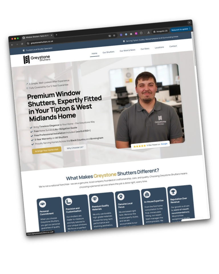
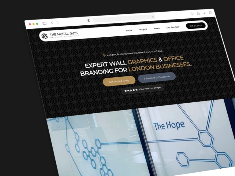
Magazine-style layouts are increasingly popular in web design for their ability to showcase diverse content in a visually appealing manner. However, while they offer several advantages, they also come with challenges. This article explores the pros and cons of magazine-style layouts and provides practical insights for businesses looking to implement this design.

Introduction
Magazine-style layouts mimic the look of traditional print magazines, featuring multiple columns, diverse content blocks, and rich media. They are ideal for websites that need to display a variety of content types, such as news sites, blogs, and e-commerce platforms. However, their complexity can present design and performance challenges. Understanding the benefits and drawbacks of these layouts can help businesses make informed decisions about their web design strategy.
Pros of Magazine-Style Layouts
Visually Appealing
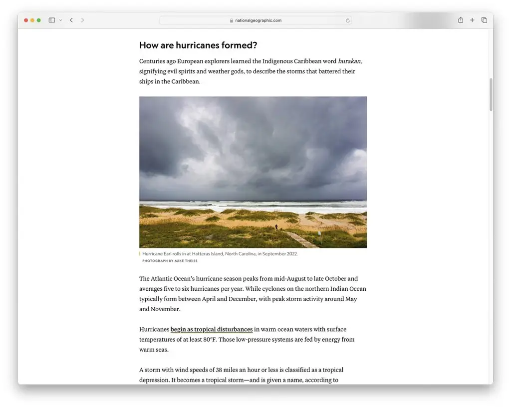
Magazine-style layouts are known for their visual appeal. They use a mix of images, text, and multimedia to create a dynamic and engaging user experience. For example, the National Geographic website utilises a magazine-style layout to showcase its stunning photography alongside compelling articles, creating an immersive experience for visitors.
Showcasing Diverse Content
These layouts are perfect for displaying a variety of content types in an organised manner. News websites like The Guardian use magazine-style layouts to present articles, videos, and interactive features in a cohesive and visually attractive way, making it easy for users to find and engage with different types of content.
Enhancing User Engagement
A well-designed magazine layout can keep users engaged by offering a visually stimulating browsing experience. Sites like BuzzFeed use this style to combine articles, quizzes, and videos, which encourages users to explore more content and stay on the site longer.
Cons of Magazine-Style Layouts
Complexity in Design
Designing a magazine-style layout can be complex and time-consuming. It requires careful planning to ensure that all content is organised logically and aesthetically. For instance, balancing multiple columns and content blocks without overwhelming the user can be challenging. The New York Times website, while visually impressive, requires meticulous design and frequent updates to maintain its layout.
Potential Performance Issues
Magazine-style layouts can slow down page loading times due to their rich media content and complex structure. This can negatively impact user experience and search engine rankings. Websites like Mashable, which use heavy multimedia elements, need to employ advanced optimisation techniques to maintain acceptable loading speeds.
Real-life Examples
Example 1: Vogue
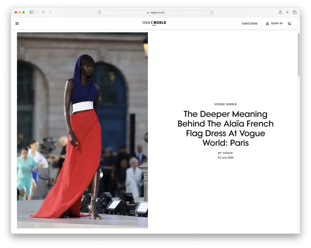
Vogue’s website is a prime example of a successful magazine-style layout. It features high-quality images, fashion articles, and videos in a visually compelling format. The site manages to balance a wealth of content while maintaining a stylish and organised look.
Example 2: Wired
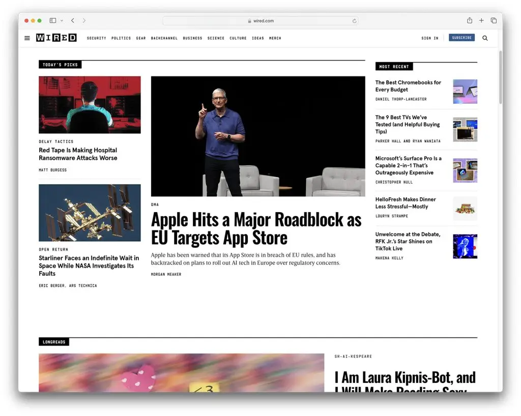
Wired uses a magazine-style layout to present its technology news and features. The layout includes a mix of articles, videos, and infographics, arranged in a way that keeps the content engaging and easy to navigate. Despite the complexity, Wired ensures that the site remains user-friendly and visually appealing.
Example 3: Airbnb Magazine
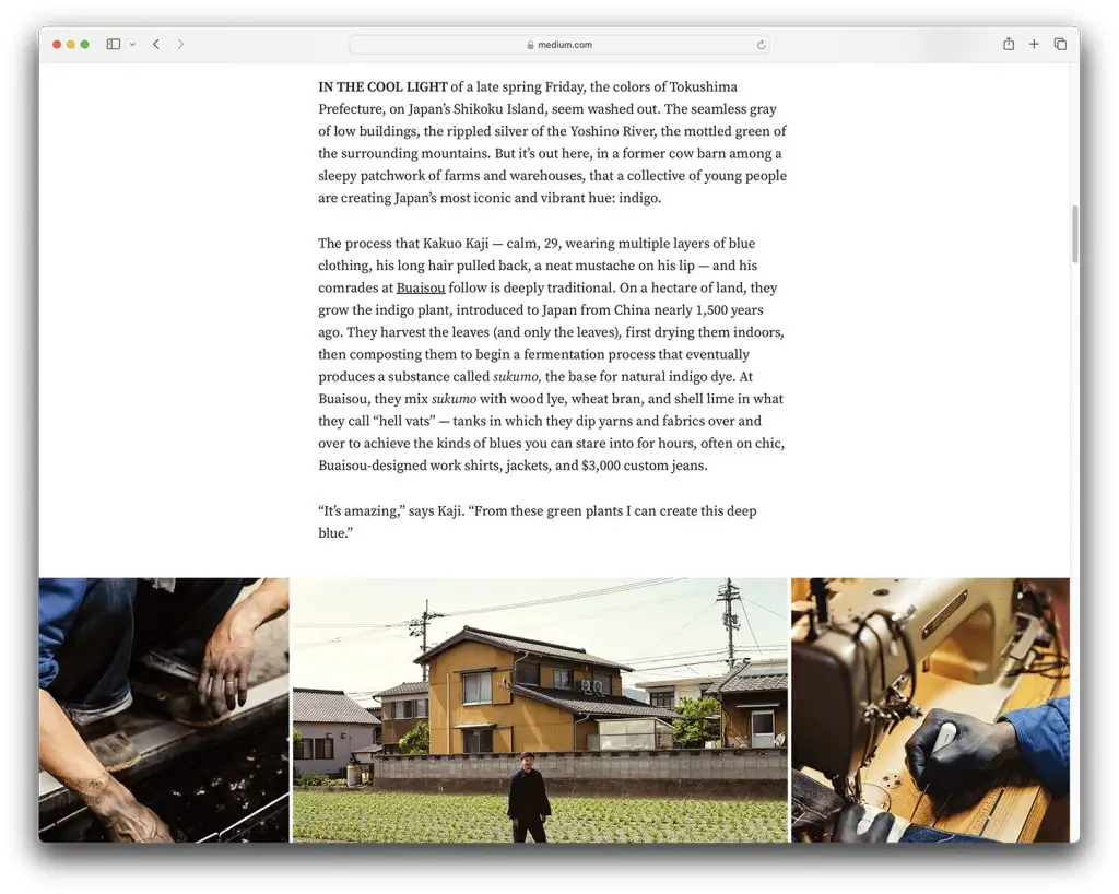
Airbnb Magazine uses a magazine-style layout to inspire travellers with rich storytelling and beautiful images. The site’s layout highlights destination guides, travel tips, and user-generated content, creating an engaging experience that reflects the brand’s ethos.
How to Create Stunning Magazine-Style Layouts
Balance Visual Appeal with Performance

To create an effective magazine-style layout, balance visual appeal with performance. Use high-quality images and multimedia, but optimise them for fast loading times. Tools like Elementor can help design responsive layouts that adapt to different devices without compromising on aesthetics.
Organise Content Logically
Ensure that content is organised in a way that is easy to navigate. Use clear headings, subheadings, and categorisation to guide users through the site. For example, categorise articles by topic and use featured sections to highlight the most important content.
Employ Advanced Optimisation Techniques
To mitigate performance issues, employ advanced optimisation techniques. This includes using lazy loading for images, compressing media files, and leveraging browser caching. Regularly monitor your site’s performance using tools like Google PageSpeed Insights and make necessary adjustments.
Regular Updates and Maintenance

Magazine-style layouts require regular updates and maintenance to remain effective. Continuously add fresh content and tweak the design based on user feedback and analytics. This ensures that the layout remains relevant and engaging.
Conclusion
Magazine-style layouts offer a visually appealing and effective way to showcase diverse content on your website. However, their complexity and potential performance issues mean that businesses need to carefully plan and execute their design strategy. By balancing visual appeal with performance, organising content logically, and employing advanced optimisation techniques, businesses can create stunning magazine-style layouts that enhance user engagement and satisfaction.
Practical Tips for Businesses
- Start with a Wireframe: Plan your layout with a wireframe to organise content before adding design elements.
- Optimise Media: Use tools like TinyPNG to compress images and videos for faster loading times.
- Test Responsiveness: Ensure your layout works well on all devices, including tablets and smartphones.
- Monitor Performance: Use analytics tools to monitor site performance and user behaviour, making adjustments as needed.
- Update Regularly: Keep your content fresh and your design up-to-date to maintain user interest and engagement.
Magazine-style layouts can transform your website into a visually compelling platform that effectively showcases diverse content. By understanding the pros and cons and implementing best practices, businesses can create engaging and efficient magazine-style websites that captivate their audience.

